
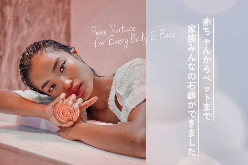

LPをデザインするにあたり、よりクリエイティブなものを作りたかったので「こんな商品がもしあったら素敵だな」と思うものについて考えました。
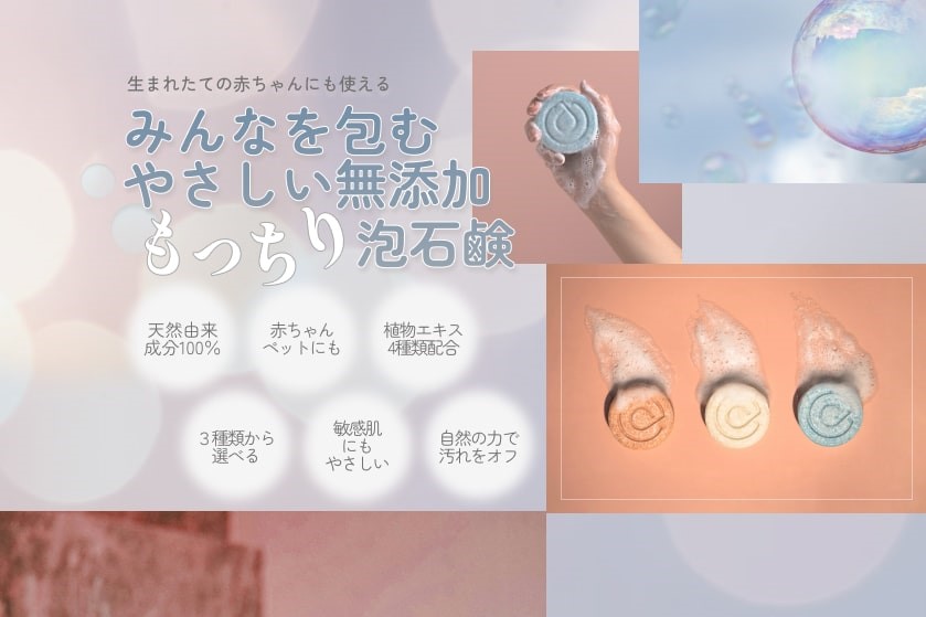
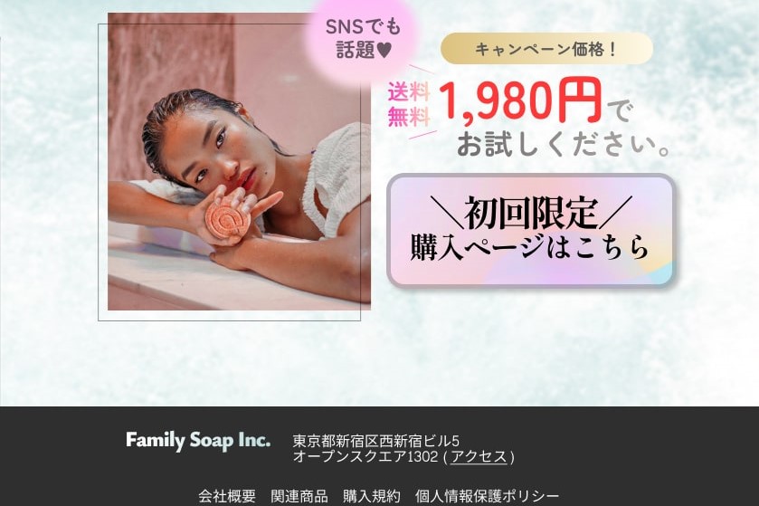
初めて見た人にも一目で商品の魅力がしっかりと伝えることができるLPにしたいと考え、フォントを混合させて伝えたい部分に存在感をもたせたりアピールポイントを箇条書きにすることで商品を使うメリットがたくさんあることが直感的にわかるようにしました。
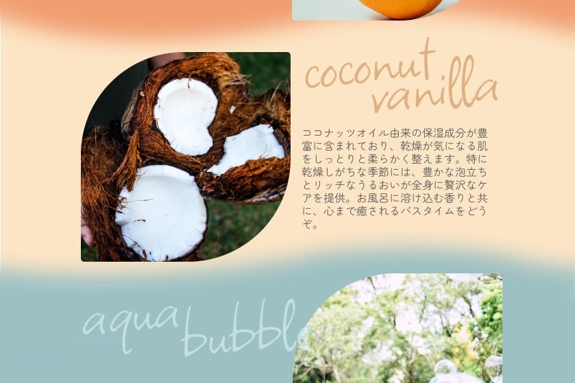
普通の石鹸とは違う『生まれたての赤ちゃんやペットにも使える』という点をアピールするため、文言だけでなく所々に写真も使用することで大事なポイントが見落とされることのないよう工夫しました。
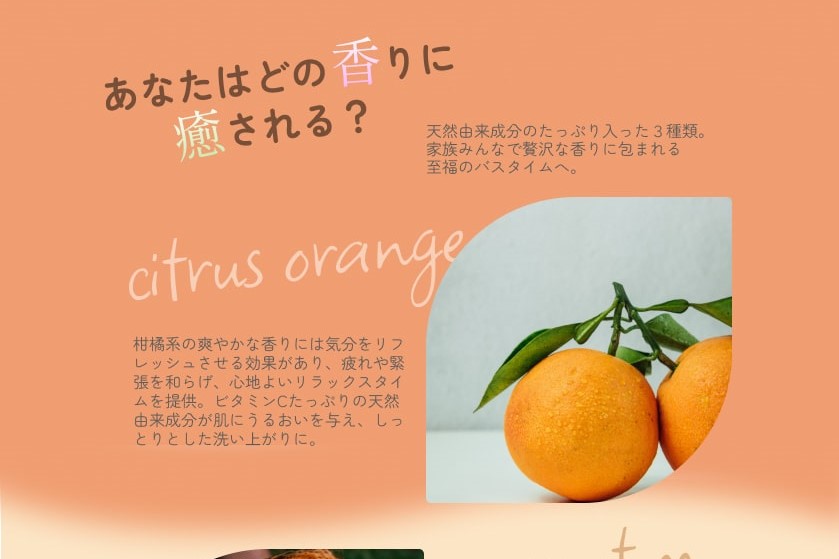
清潔感、健康的、しゃぼん玉、ファミリー、ジューシー
商品の持つ清潔で爽やかなイメージと、明るく健康的でジューシーな雰囲気を融合させ、しゃぼん玉をキーワードに薄めのブルーとオレンジを全体の基本カラーとして使用しました。
To make myself creative, I tried to think of something that "would be nice if it existed," and then I came up with this product.
I used a different typeface to emphasize a word in the top heading, quickly conveying the soap's appealing and unique texture to viewers at first glance. I placed succinct words to describe its great points in little circles in the hero sections so that viewers can instinctively understand that there are many reasons to use the product.
As this soap is not the usual one, I used images several times to highlight that "you can use it for a newborn baby, or even for your pet."
clean, healthy, bubble soaps, family, juicy
Integrating the fresh, clean image of the product and blight, healthy atmosphere, I selected light blue and orange as the main colours for the entire design, with the keyword "bubble soaps".